Case Study: TC Technologies Tri-Fold Brochure Redesign
One of the projects I’m most proud of this year was a tri-fold brochure redesign for TC Technologies. Their old brochure? Outdated, off-brand, and honestly tough to read. My task was to clean it up, bring it in line with their current branding, and make it work for them—something clear, balanced, and professional.
The Challenge
When TC Technologies reached out, their goals were pretty straightforward:
Update the look to match their current branding.
Make the content easier to read without shrinking the font or overwhelming the layout.
The biggest challenge was the sheer amount of content they needed on the brochure, particularly the detailed service plans. Too much text on too little space can quickly turn into a mess, and we weren’t about to let that happen.
The Branding Connection
When I started the redesign, I noticed a big disconnect between TC Technologies’ website and their old brochure. It was clear they’d either recently rebranded entirely or shifted their visual style significantly.
Their site featured:
A clean, modern look with plenty of breathing room.
Bold, professional typography that commands attention.
A simple, high-contrast color palette—red, black, and white—that conveys trust and professionalism.
Using their website as a guide, I pulled these visual elements into the brochure design to ensure a cohesive look across their print and digital materials. This approach made the brochure feel like a natural extension of their updated brand.
My Process
1. Finding a Starting Point
As mentioned above, the client didn’t have a formal branding guide, so I started with their website. By pulling their existing colors, fonts, and overall style, I had a solid foundation to work from. This gave the new design a consistent, modern look that felt like it belonged with the rest of their brand.
2. Tools and Techniques
I worked in Adobe Illustrator to handle the layout design and visual hierarchy. On the inside pages, I incorporated a single stock image in the bottom-left corner to balance the composition. It’s easy for content-heavy layouts to feel lopsided, so this subtle visual touch added structure without competing with the copy.
3. Tackling the Content Challenge
Let’s face it—fitting a ton of text into a small space without losing clarity isn’t easy. To solve this:
I suggested ways the client could streamline their copy to keep the focus on the most important details.
The client took my recommendations and tightened up the content, making it more concise.
I organized the information into clear sections, with bold headings and thoughtful spacing to keep everything easy to follow.
This back-and-forth collaboration made all the difference. The result? The content felt manageable and the design stayed clean.
The Result
The final brochure was a huge step up:
It perfectly matched TC Technologies’ current branding for a cohesive, professional look.
The layout was cleaner, clearer, and easier to navigate, even with all the detailed service information.
The subtle background image helped balance the composition and gave the design a little extra polish.
The client was pleased with the redesign and appreciative of how it aligned with their brand and improved the brochure’s clarity. Seeing the transformation come together was a rewarding experience and a solid step forward for their marketing materials.
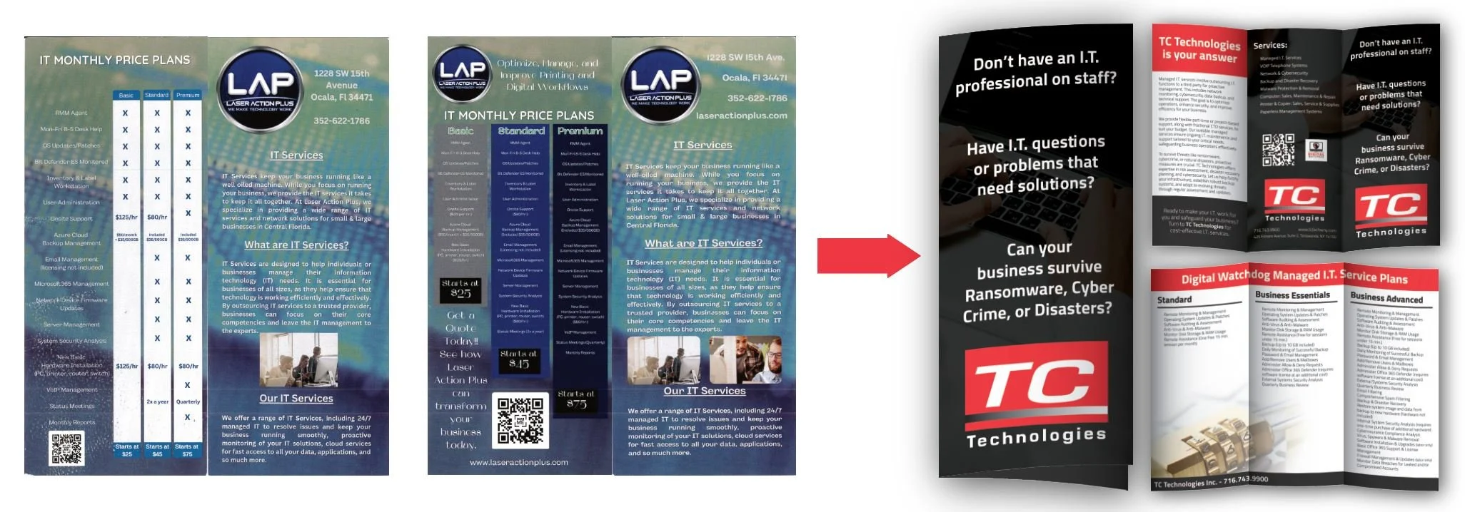
Before and After: A Visual Transformation
When I first saw TC Technologies’ old brochure, it was clear there was room for improvement. Here’s what I was working with:
Outdated visuals: Busy gradients and clashing colors that didn’t align with their brand.
Cluttered content: Small fonts, heavy text blocks, and a lack of breathing room.
Missing structure: Important details like pricing plans were hard to scan, which defeated the purpose of having them there.
In the redesign, I focused on cleaning it up:
Using modern fonts, colors, and spacing pulled from their website to match their branding.
Simplifying the layout with clear headings, logical groupings, and thoughtful alignment.
Strategically placing a background image to balance the design without getting in the way.
The result speaks for itself: a brochure that’s clean, modern, and—most importantly—works for the client.
Lessons Learned
This project reminded me that you don’t always need a branding guide to get the job done. By paying close attention to what the client already had (like their website) and working together to refine the details, I was able to bring their vision to life.
It also reinforced just how important collaboration is—sometimes you need to guide clients toward a solution, but when you’re on the same page, the results are always better.
Redesigning TC Technologies’ tri-fold brochure was a rewarding project that showcased my ability to take a cluttered, off-brand design and transform it into something clean, professional, and effective.
If your marketing materials are feeling outdated or cluttered, let’s talk. I’m here to help you refine, refresh, and elevate your brand’s visuals—over coffee, of course. ☕


